When I come across great little elegant nuggets of Visual UI or Behavioral UX design, I collect it here. Once I have a few elegant interactions, or some ‘crude’ ones, I’ll publish the post and continue with the next post, and so on.
A horizontal scroll-bar
I came across this pretty little blue bar at an Atlassian blog-post. It nifty scrolls left to right, grabbing your attention as it is close to where you are actually reading. Unlike the standard vertical scroll-bar, which on a wide (monitor) screen is far out of sight, this gave me direct visual cues in my peripheral vision. Because of its behavior I was drawn to it in the first second, in the second second I grasped it’s reason to be. Nice!

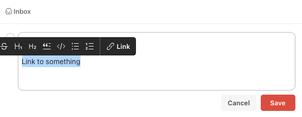
Paste link on text
Surely this must be patented by ToDoIst, though I remember to have seen it in multiple places…
Here is how it works: in many text editing programs (like this one from WordPress) you select a text block, select the ‘link’ function in a contextual menu, paste the URL you want to link to, confirm > text block has a link.
In ToDoIst you select the text block, paste the URL and voilá, the text block has a link.
That’s simple and just logical. These are the type of interactions that trigger me and surely also why other user’s love them; it was right in front of you, you just needed a smart (designer) mind to unveil it.


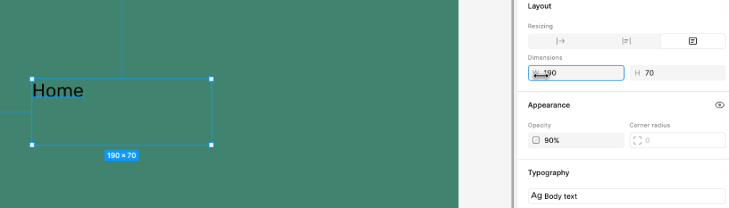
Figma – drag on a parameter to adjust
In a Figma tutorial I discovered a little gem when adjusting object parameters, like width and height of a text box. There is a little hint as the cursor changes to a left-right arrow icon when you hover over the parameter (w or h). By click & drag you adjust the value accordingly. A pretty sweet interaction!
Only hurdle what I have with this nice like idea is that, semantically, you want to move your mouse in a certain direction. More height (h) is wired in my brain as moving the mouse up, not right. The interaction paradigm here is that you move left to decrease, and right to increase. Perhaps this is why I have never heard my design colleagues sharing this when they taught me Figma.
Not so elegant UX
Not everything is elegant and strides with pride! In my quest for finding those visuals, interactions and behaviors that trigger me, it is sometimes easier to find things that annoy me. A very human thing to do 😉
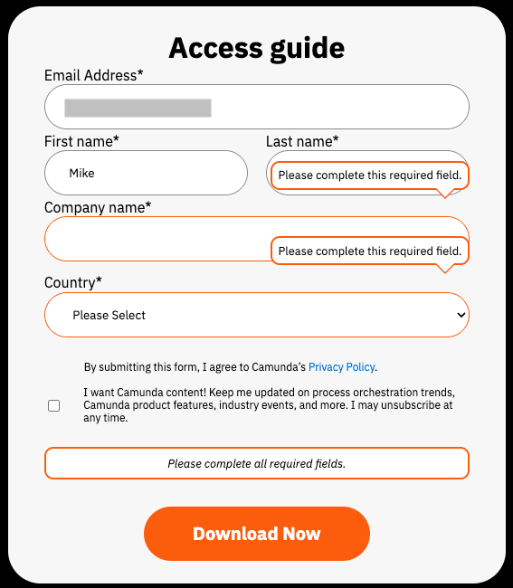
This example came from a site where I wanted to subscribe for a document download. I accidentally pressed the ‘Tab’ key too fast, and I jumped a field too far. This would not have been a problem, except directly a ‘data validation’ pop-up appeared trying to tell me what I missed. Normally not a bad interaction, except when you get the error notification directly after opening the form.. (but that is for another post ;). In this case, the pop-up obscured the entry fields and I could not see if I have typed in my details correctly. Recovering from error is such an UX Design principle 101, and here it failed
Needless to say, I skipped the process and did not download that document…
Sources & Acknowledgments
- Atlassian (blog-post) https://www.atlassian.com/blog/teamwork/what-is-conways-law-acmi
- ToDoIst (website tutorial) https://www.todoist.com/help/articles/format-text-in-a-todoist-task-e5dHw9
- Figma tutorial (Youtube tutorial) https://www.youtube.com/playlist?list=PLXDU_eVOJTx7QHLShNqIXL1Cgbxj7HlN4
- Camunda (website) https://page.camunda.com/wp-ai-powered-process-orchestration?utm_medium=paid_leadgen&utm_source=tldr&utm_campaign=Guide.UltimateGuideToAIPoweredProcessOrchestration.25Q2.EN&utm_content=aug_ai_newsletter

Leave a comment